A shed color can read as garden sculpture or disappear behind trees, and the difference comes down to whether you want charcoal gray, forest green, or bright colors against the fence line.
Charcoal gray, forest green, and navy blue each do a different job on a shed, so the first thing to sort out is whether you want the thing to disappear, settle into the yard, or stand out from the street.
Charcoal gray hides dirt through muddy seasons while bright colors like the reds and blues in this list need UV-resistant paint rated against a single season of direct sun.
1. Charcoal Gray
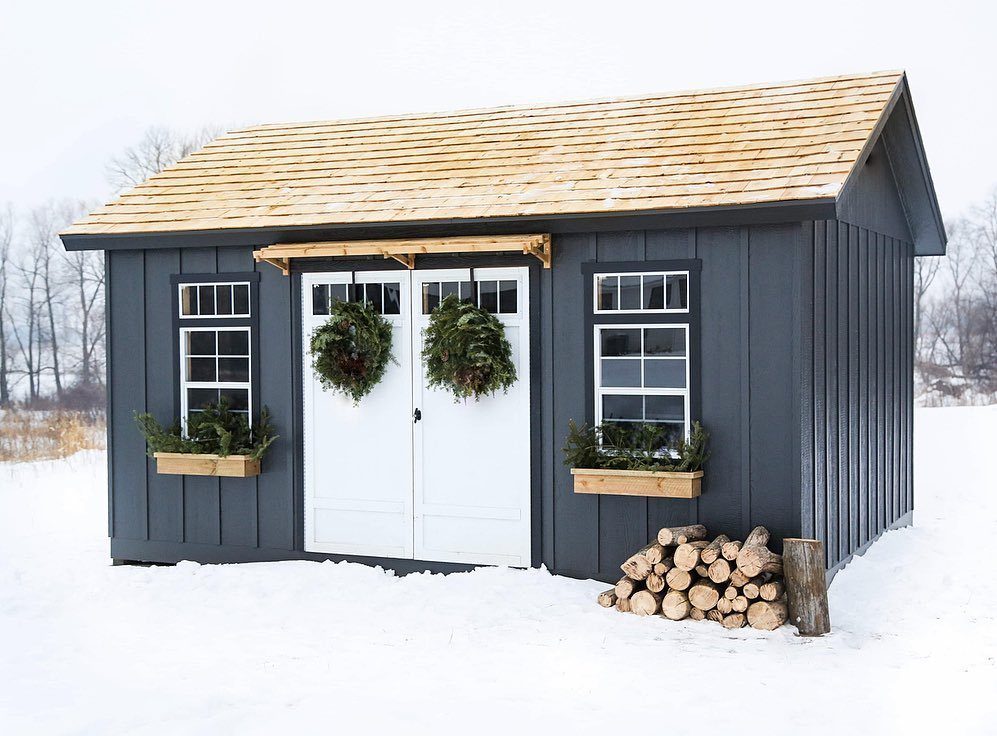
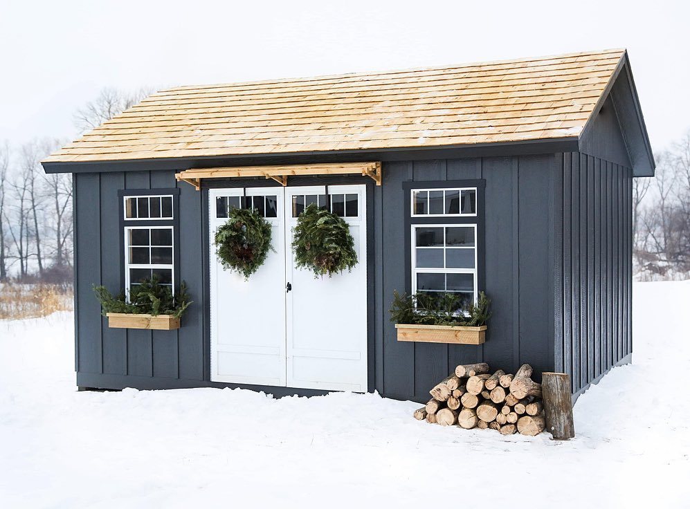
Charcoal gray reads as a deliberate choice rather than a default. It sits between black and weathered zinc, so it pairs with cedar trim or corrugated metal without fighting for attention.
I would use this on a shed that doubles as an office or gym, where the structure needs to look finished enough to face the house.
The tone hides dirt well, which matters if your yard sees hard use through muddy seasons.
White doors and window frames lift charcoal gray without adding a second color to the walls. If your house already carries black or gray trim, the shed stops looking like an afterthought.
2. Forest Green
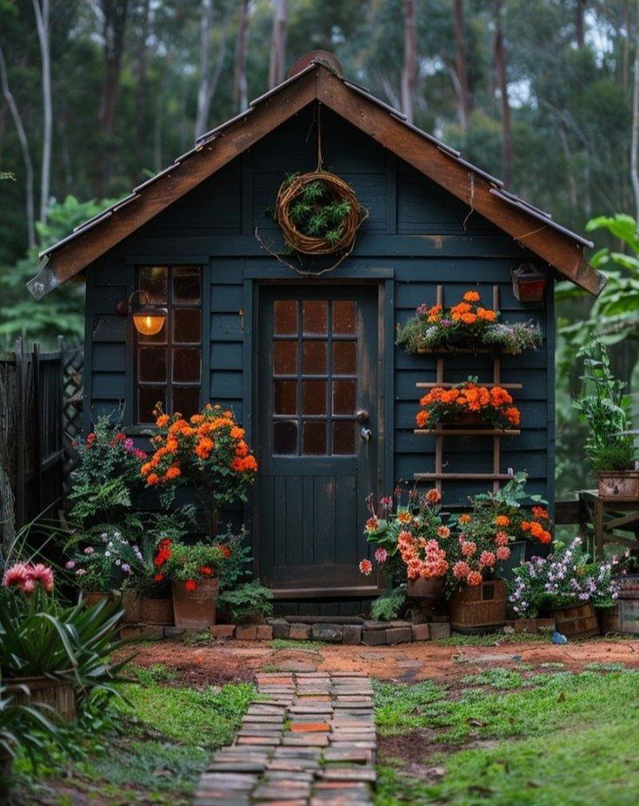
Forest green works best when you want the shed to settle into its surroundings rather than announce itself. In a yard with mature trees or heavy planting, the color goes quiet.
Orange flowers against that green make the shed pop without changing the paint. I would keep the trim wood-toned rather than white; the contrast feels less staged.
A potting bench inside makes particular sense with this color. The whole structure starts to feel like a garden tool that happens to have walls.
3. Sage Green
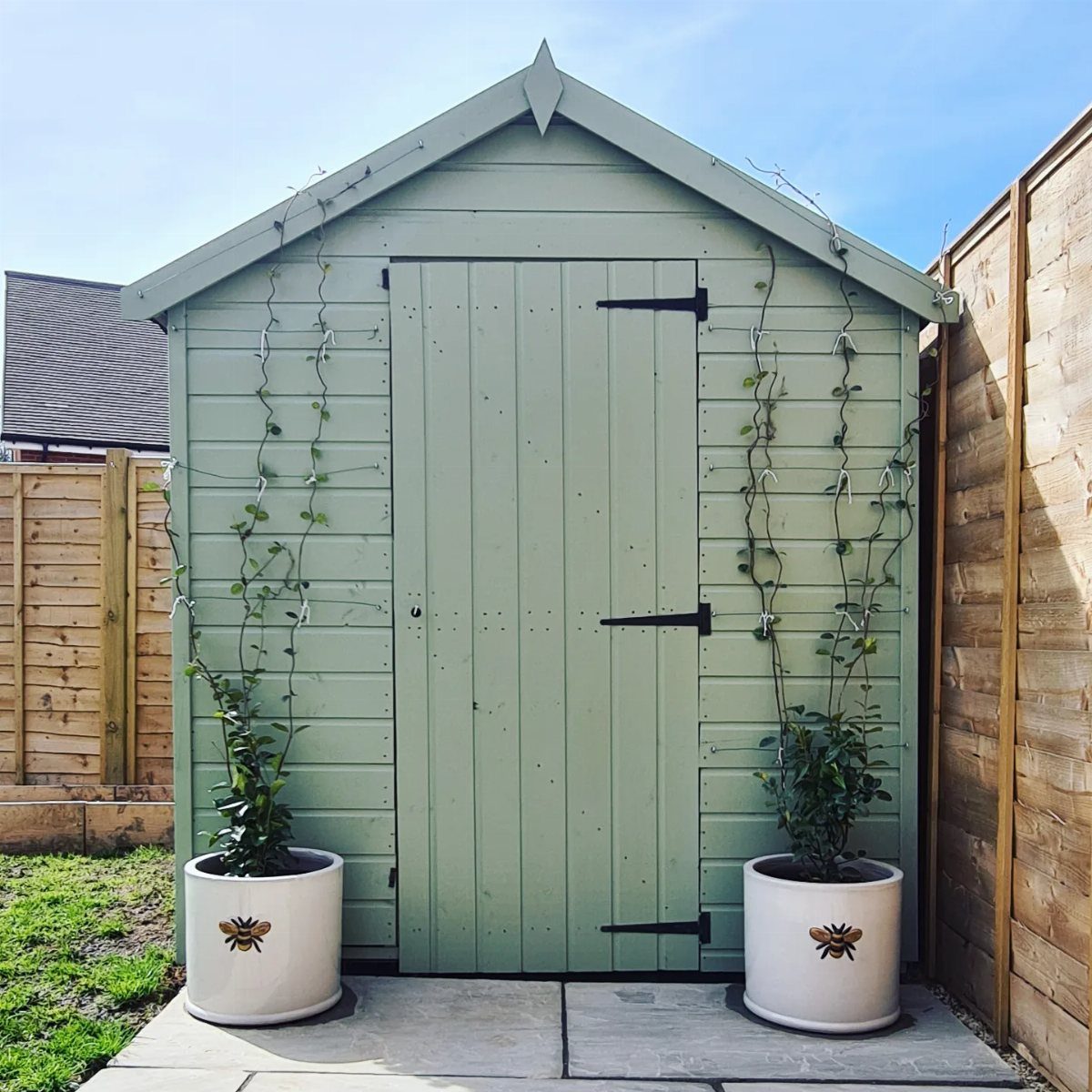
Sage green carries less weight than its deeper cousins. Stone underfoot and black hardware keep sage green current without trying hard.
I like this for small sheds that sit close to the house or patio, where a louder color would tire quickly. The tone picks up on actual foliage without matching it exactly, so the shed belongs without disappearing.
Matte black hinges and handles give sage enough edge to avoid looking apologetic. Bronze works too if your other outdoor metal leans that way.
This is the one I would pick for a first project; it forgives uneven brushwork and looks intentional even on uneven siding.
4. Bright Colors
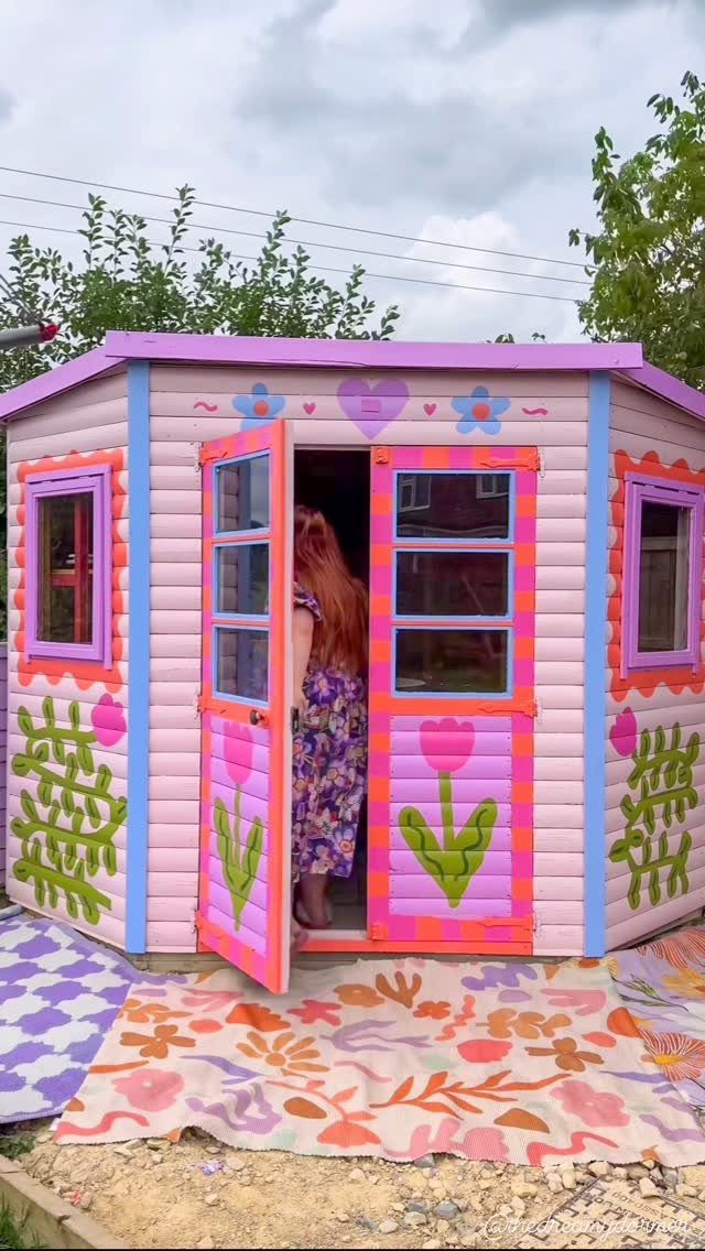
Bright colors ask for commitment. Pink, orange, blue and purple with painted florals turn the shed itself into the garden; rugs outside extend the gesture to the ground.
UV-resistant paint matters here more than with muted tones. A bold orange or yellow will shift within a season of direct sun if the formula is not rated for it.
That is the cost of the energy these colors bring.
I would reserve this for a playhouse, a studio, or a shed visible from a window you look through daily. The mood is the whole reason to do it, though the neighbors will remember which yard is yours.
Your garden will read around it.
Painting the interior door a contrasting shade, orange against blue outside, extends the logic inside where fewer people see it but you do.
5. Earthy Tones
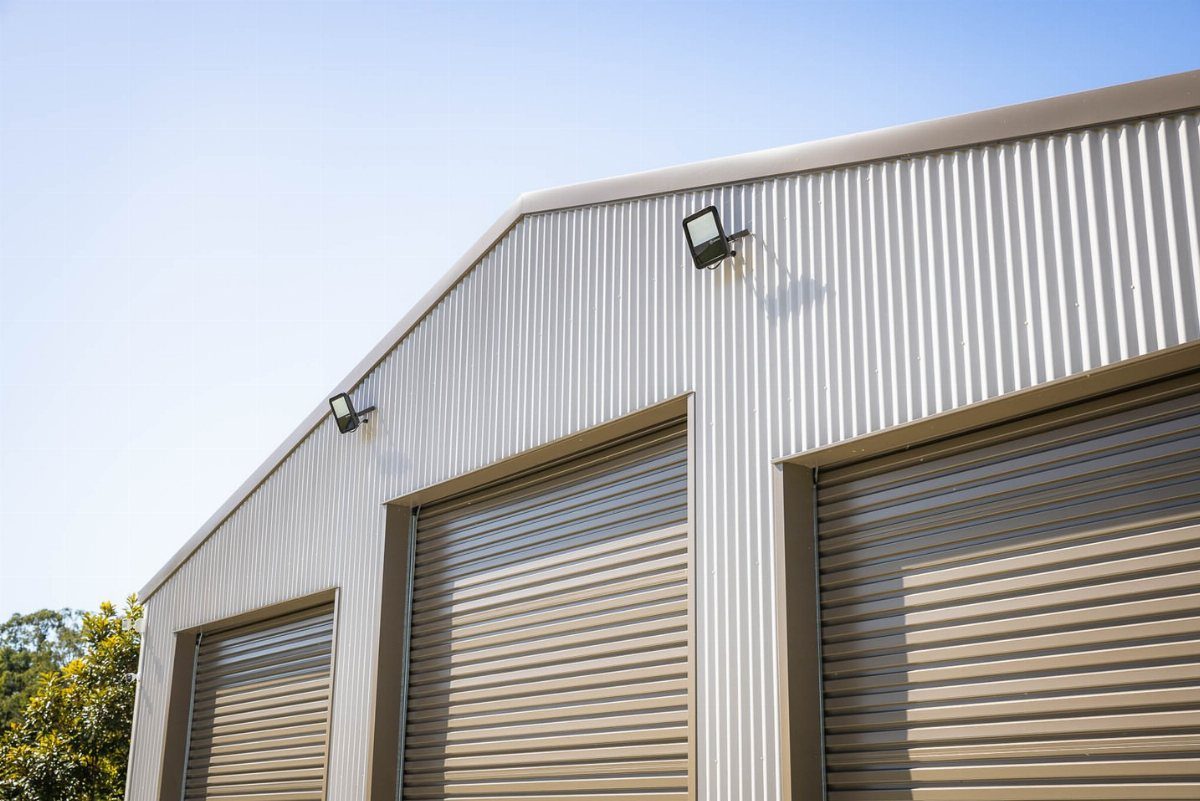
Earthy tones borrow from what is already in the yard. Bark, dry grass, weathered stone: a metal building in tan reads as dirt and sky together.
This approach suits corrugated siding especially well. The ridges catch light and shadow, and a neutral color lets that texture do the work rather than competing with it.
For a garage or workshop shed, where function leads, this keeps the structure from dominating the view. Three roll-up doors suggest storage and vehicle space; the color supports that utilitarian read without making it ugly.
I would add matte black hardware or galvanized metal details if the budget stretches. The contrast gives the eye somewhere to land.
6. Rustic Wood
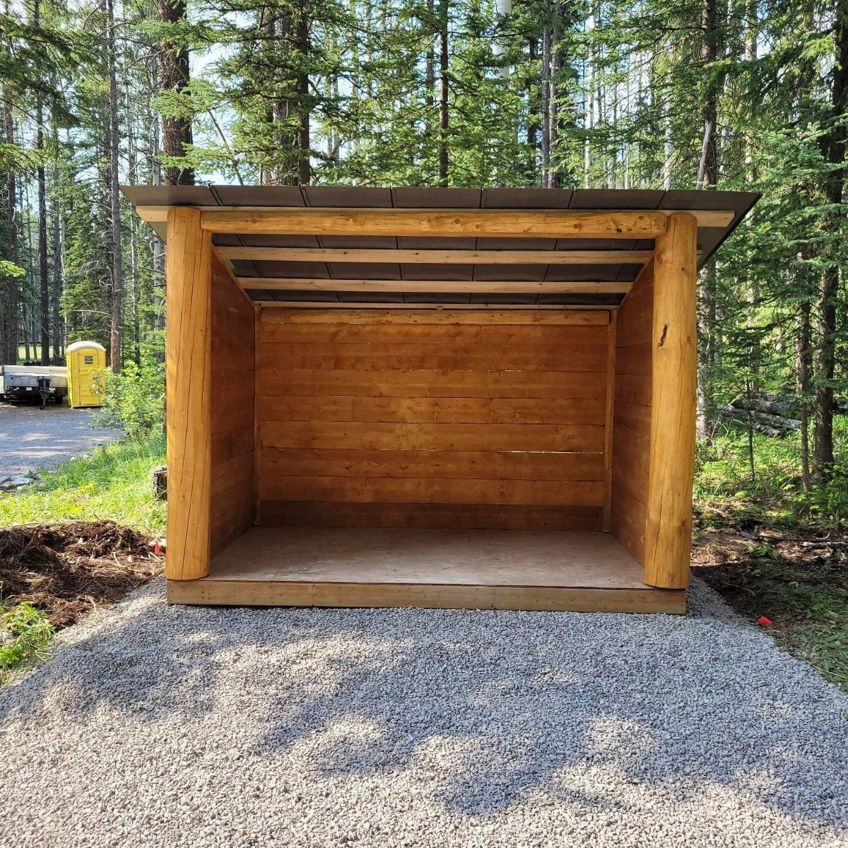
Rustic wood means stain, not paint. Thick logs and horizontal boards with the grain visible, open on the front; nothing about it reads as finished in the conventional sense.
A transparent or semi-transparent stain lets the wood age in place. The color darkens where water hits, lightens where sun reaches, and the whole thing looks earned rather than neglected.
I would use this for a lean-to or shelter shed, open on one side, where the point is to blend with trees rather than stand apart. Gravel under the wood feet matters; it keeps them dry and slows rot.
White trim would ruin the effect. If you need contrast for hardware or doors, use galvanized metal or black iron, materials that read as found rather than chosen.
7. Rich Reds
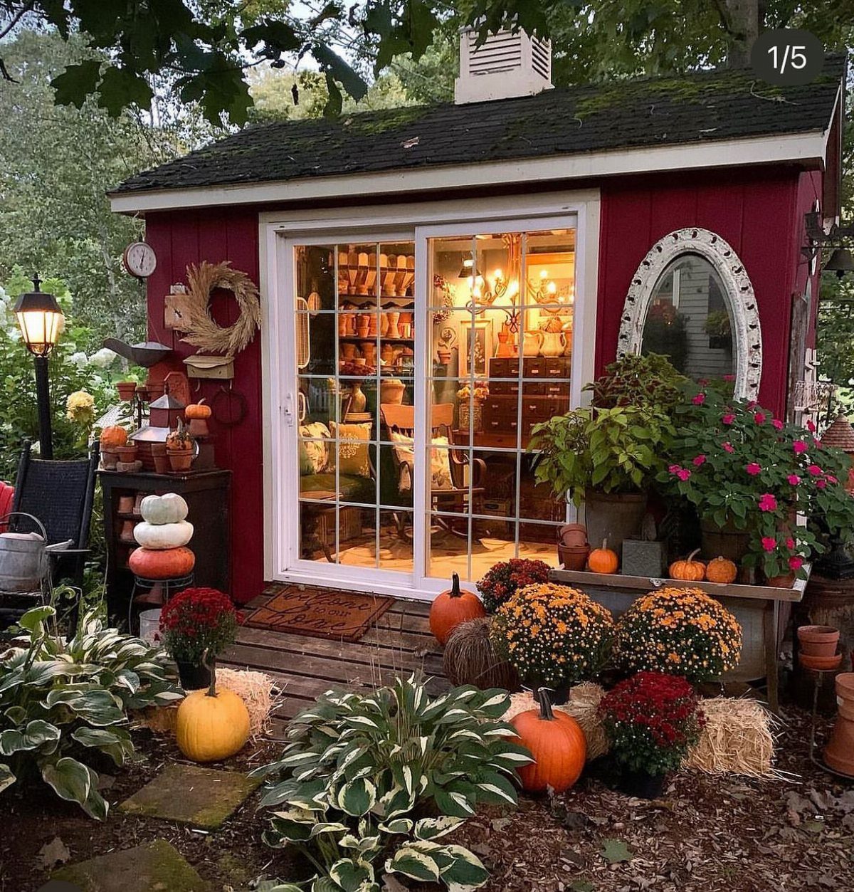
Deep red siding on a shed reads country before you even step outside. Barn red and crimson lean hard into that farmhouse feel, and the white trim keeps it from looking like a leftover paint can.
I like this best when the house itself is neutral or already carrying some traditional weight. Against brick or pale clapboard, the red becomes punctuation instead of noise.
Bright reds skew younger and more playful; deeper shades settle in as if they have always been there.
A red shed shows every scuff and pollen streak by August, so plan on a touch-up coat every couple of years or pick a deeper burgundy that hides dirt longer.
Red shows dust, pollen, and water spots faster than mid-tones, and fading on the sun-facing wall happens in a few seasons without decent paint. Plan on two coats minimum and a solid primer.
Who it suits: someone with mature trees or autumn plantings nearby, where the color picks up something natural instead of fighting it.
8. Gray and White
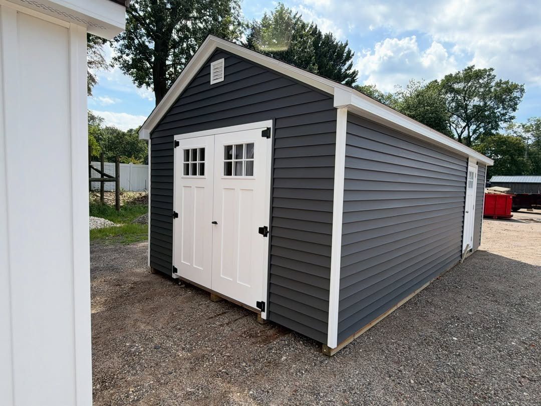
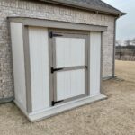
Charcoal gray siding with crisp white trim gives a shed the same clean lines people pay architects for.
The white doors and corner posts catch light; the dark body recedes into shadow and makes the structure feel smaller than it is.
White on its own broadcasts every grass stain and pollen streak, which is why the pairing matters. The gray takes the weathering; the white stays limited to trim you can wipe down or touch up in an hour.
Slightly off-white paint here buys you a few extra days between cleanings.
This palette works on gravel lots, against fences, or tucked under trees where a warmer color would compete with the canopy. It also plays well with metal roofing in black or zinc if you are replacing that too.
Skip it if your yard already runs cool and gray everywhere; the shed disappears instead of grounding the space.
9. Navy Blue
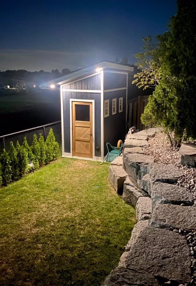
Navy blue sits just short of black, which is exactly why it works for sheds meant to look finished rather than hidden.
White trim gives navy siding structure; a natural wood door adds warmth that keeps the whole thing from reading like a corporate logo.
I would put this on a lean-to or any shed where height matters. The dark body swallows shadow and makes the roofline feel lower than it is, while the white trim draws the eye to the door and any windows.
One builder who finished a similar project in four months went with this exact scheme to maximize storage and loft headroom inside.
Copper gutters or cedar shingles push it further toward custom; without them, standard white trim still holds its own.
The catch: navy heats up in direct summer sun. If the shed sits unshaded and you are storing anything temperature-sensitive, ventilation or lighter walls might win.
10. Black and White
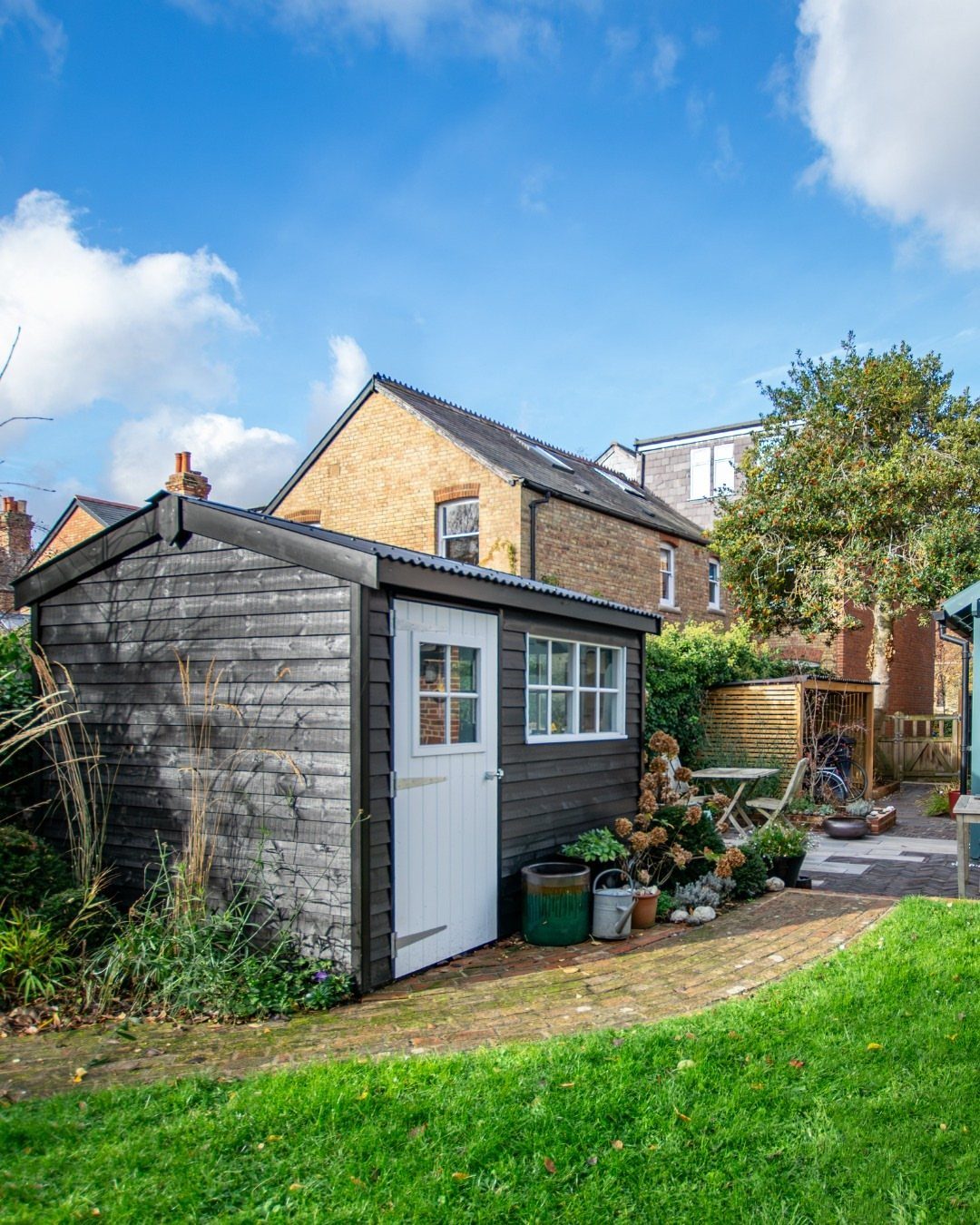
Black siding with a white door and window frames is the highest contrast move on this list, and it only works because the white is so limited.
Keep the door as a single bright rectangle and the window small; too much white breaks the effect. That restraint keeps it from looking like a cartoon.
What sells this scheme is the landscaping around it, green grass and a few flowers against all that neutral. Green planting, brick paving, or even a basic lawn jumps forward against black in a way it cannot against softer colors.
One guide suggested extending the same treatment to fencing, and I see the logic: a black perimeter makes every shrub look deliberate.
This is not a forgiving first project. Brush marks show, lap lines show, and touch-ups never quite match.
You need solid coverage, good weather, and a full day without rush. Two coats minimum; three if the wood was previously untreated.
Best for confident painters with some siding already dark, or for anyone who treats the shed as garden sculpture rather than background storage.
Choosing the Right Shed Color
Your house already made most of the decision.
The shed’s purpose matters as much as the house. A gym or office that faces the street needs the finished look of navy or gray and white.
Storage buried behind a garage can carry a bolder color you would not want at the curb.
Landscape colors ground the choice in what is already growing. Forest green or sage makes sense where trees dominate; earthy tan belongs where dry grass and stone already set the tone.
Look at what sits behind the shed, not just what frames it.
Finish choice is part of the color decision. Matte and satin paints read current; anything glossier fights the flat light of most yards.
Sue Wadden, director of color marketing at Sherwin-Williams, says: ‘A well-painted shed can bring your whole exterior look together.
Maintenance and Durability
Dark colors hide dirt and pollen, which matters if your shed sits under trees or near a gravel drive. Faster fading hits the wall that faces south or west, and more heat gets inside through summer months.
That heat can warp stored paint or make a workshop uncomfortable without ventilation.
Light colors reflect sun and stay cooler, but white trim shows every grass stain and needs wiping down a few times a season.
The body of the shed can be mid-tone gray while white stays limited to doors and corners you can reach.
Quality of paint matters more than the color itself for weather protection.
Resin or composite sheds need less maintenance whatever color you choose. Wood sheds in stain rather than paint age visibly and need reapplication on a shorter cycle.
Testing Color Choices
Paint a square on the wall that gets the most sun and another on the shaded side. The same gray reads brown in morning light and flat by afternoon.
Let the samples dry completely before deciding; wet paint is always darker and more saturated.
Check the test patches from the spot where you will actually see the shed. A color that works up close can read as a loud block from the kitchen window or the back fence line.
Bold choices especially need that distance check.
If you are pairing colors, paint the trim sample right next to the body color. White against wet gray looks crisp; against dried sage it can read as laundry-day bright.
Wait for both to cure before judging the combination.
Season matters too. A forest green that belongs in July leaf tone can sit heavy against bare branches in March.
If your test falls in one season, imagine the opposite, or test again when the yard has turned.
Color Combinations
Accent colors from your house do not need to match the shed exactly to tie the two together.
Black door hardware on the house suggests black hinges on the shed; cedar shutters on the main structure make cedar trim on the outbuilding feel planned rather than random.
Two tones add depth without adding complexity. A neutral body with limited trim in a second color gives the eye structure to follow.
The reverse, a bright body with neutral trim, makes the shed itself the feature.
Door color can carry the accent alone. Painted window frames in the trim color extend the logic without wrapping the whole shed in contrast.
Metals count as color too. Copper gutters, galvanized steel, or matte black fixtures give the same connecting thread as painted wood.
If your house already uses one metal for railings or lighting, repeating it on the shed lamp or latch is enough coordination without full match.
Frequently Asked Questions
What is the best color to paint a shed?
Dark gray, sage green, and deep brown-toned gray are the most reliable choices. Charcoal gray hides dirt and pairs with almost any trim, while sage green forgives uneven brushwork and belongs near houses without disappearing.
Navy blue works if you want the shed to read as finished architecture rather than backyard storage.
Should your shed match your house?
Whether the shed matches the house comes down to what job you want it doing out there. Matching the house’s main color creates cohesion, especially if the shed is visible from the street.
A contrasting color adds depth and draws the eye; charcoal against green planting or navy against pale siding both work. Some areas require matching by code, so check local rules first.
What are the trendy shed colors for 2026?
Deep navy, charcoal, forest green, barn red, and black are the directions builders and buyers are leaning.
Charcoal and navy read as modern architecture; forest green settles into leafy yards; barn red carries farmhouse weight; black demands careful landscaping to avoid looking severe. Two-tone schemes like white-and-black or gray-blue-and-white are also showing up on new builds.